 M1ndseye
Healthcare Editorial Systems
Design systems built for clarity, care, and trust.
A comprehensive body of patient-facing work for Torrance Memorial Medical Center and MemorialCare, spanning guidebooks, seasonal publications, flyers, custom illustration, 3D mapping, wayfinding, and motion. Across every format, the goal was the same: make complex healthcare information easier to understand while maintaining a polished, recognizable brand experience.
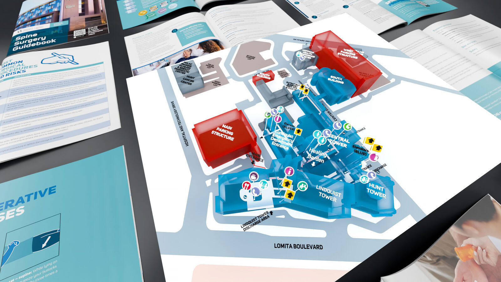
Torrance Memorial Medical Center · 3D campus map and wayfinding visualization
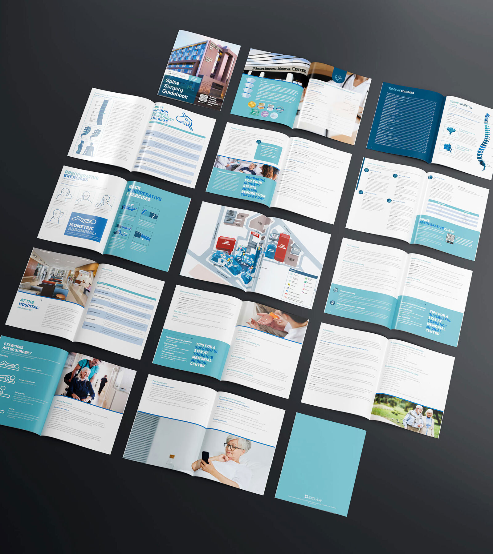
Torrance Memorial Medical Center · Spine Surgery
Turning complex clinical information into a calmer patient experience.
The Spine Surgery Guidebook combined editorial design, patient education, custom illustration, 3D mapping, and wayfinding into one cohesive system. Detailed procedural information was structured to feel approachable and easy to navigate without reducing its clinical depth.
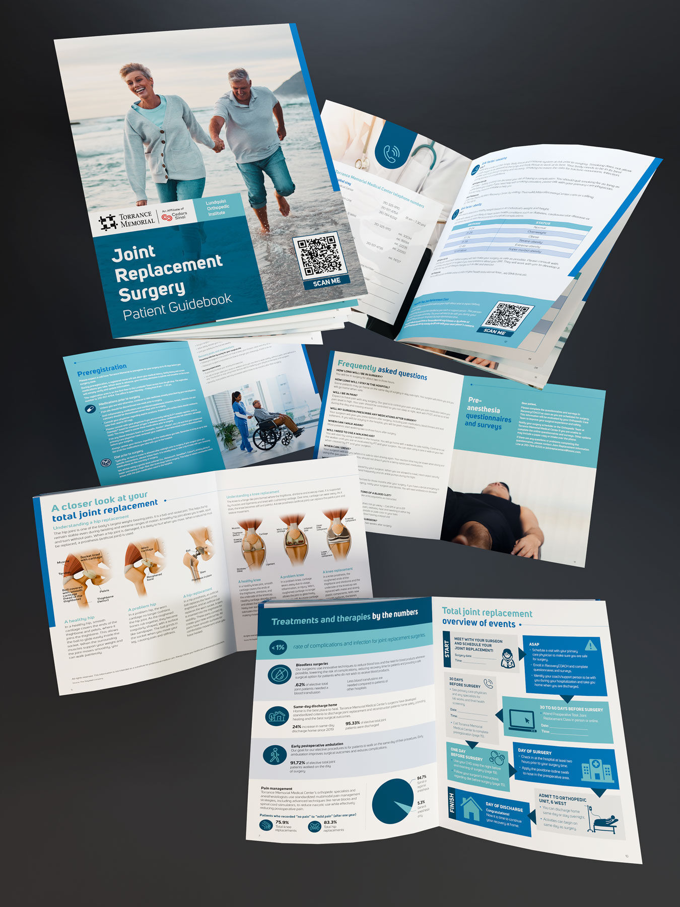
Joint Replacement Patient Guide
A distinct system built around confidence and clarity.
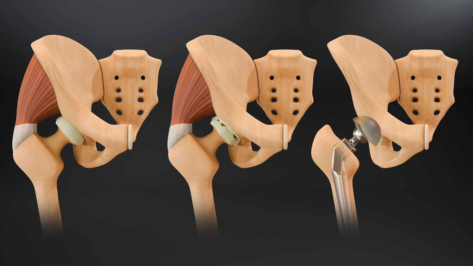
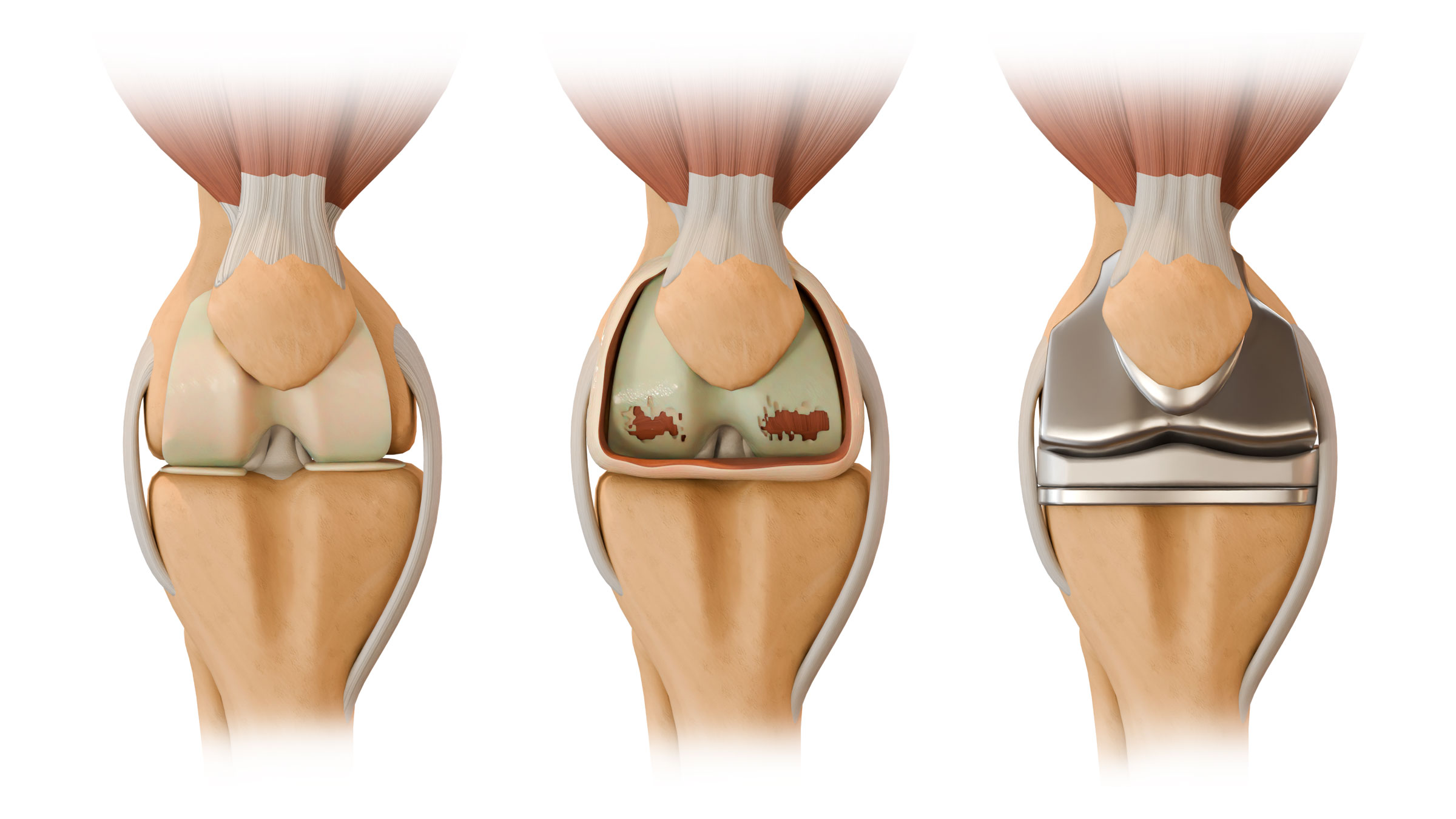
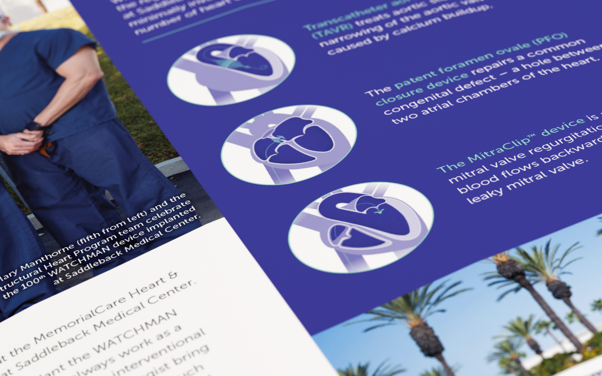
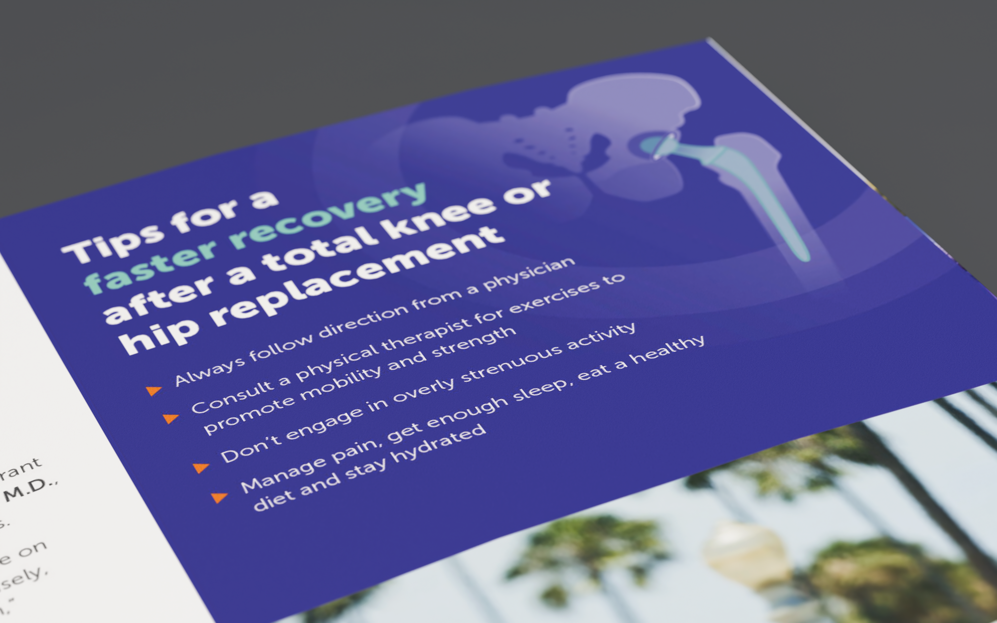
The Joint Replacement Surgery Patient Guide extended the same patient-first principles into a new visual language, bringing together anatomical illustration, timelines, FAQs, preparation, procedural guidance, and recovery information in a reassuring editorial system.
MemorialCare · Editorial System
Consistency across every patient-facing touchpoint.
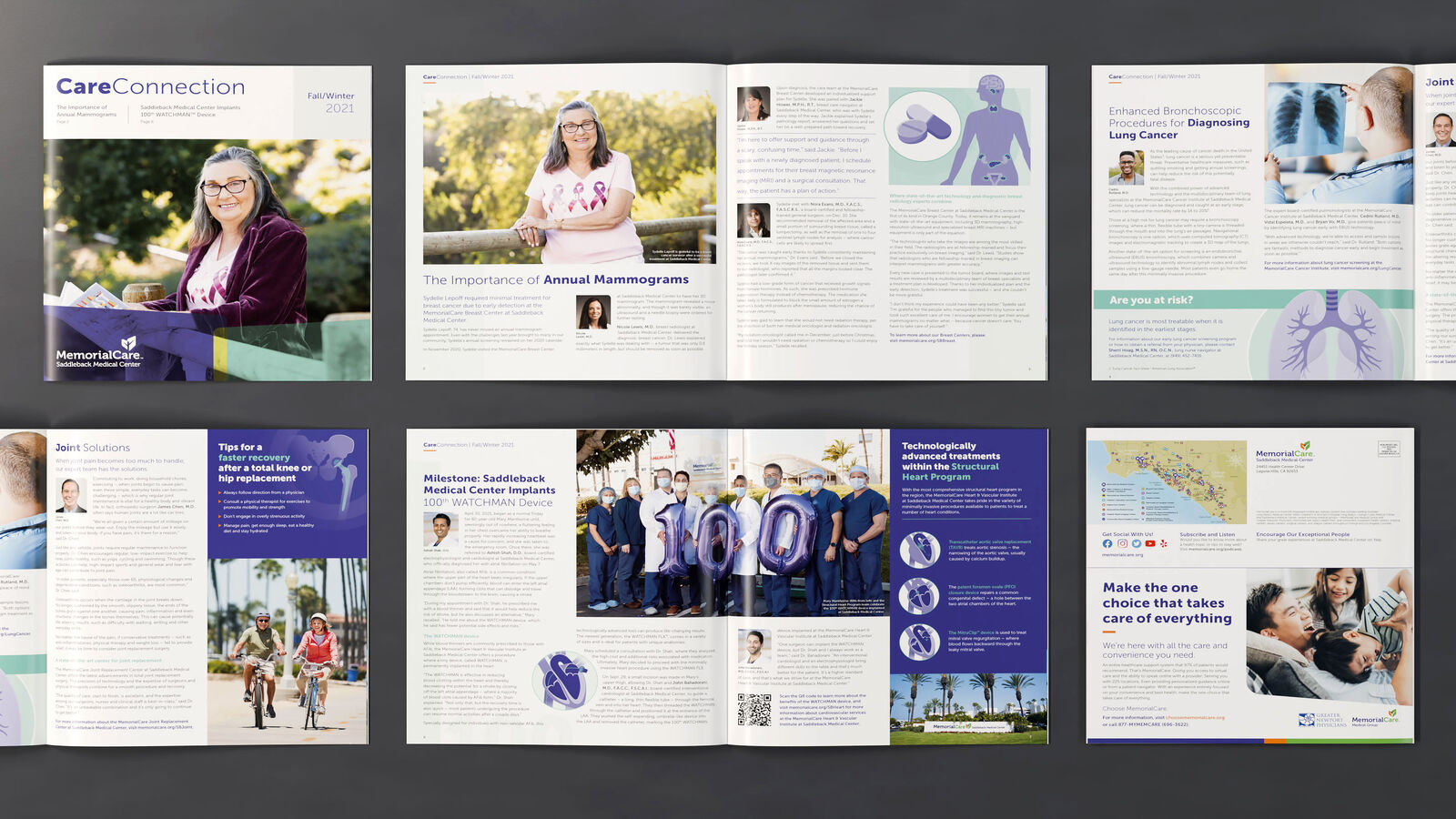
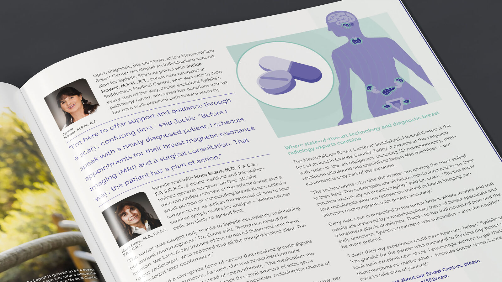
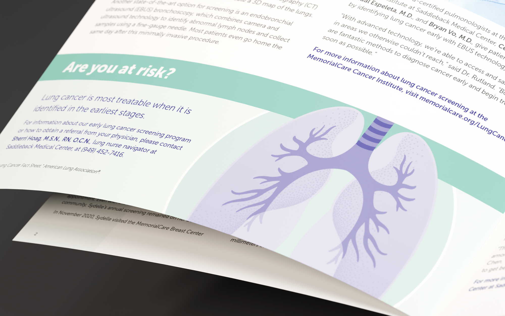
Flexible typography, modular page structures, coordinated color systems, and reusable illustration styles allowed the brand to adapt across service lines without becoming repetitive. Each piece needed to feel specific to its audience while remaining unmistakably part of the same healthcare system.
Patient Guidebooks
Complex information made calm and approachable.
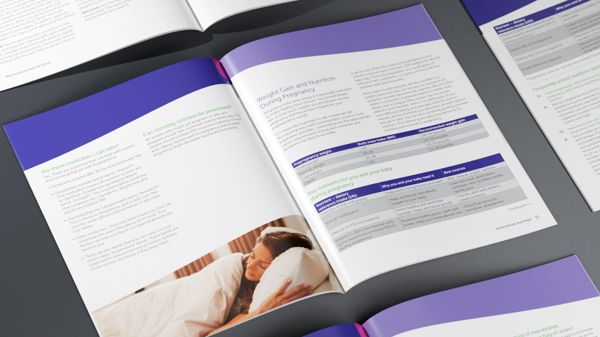
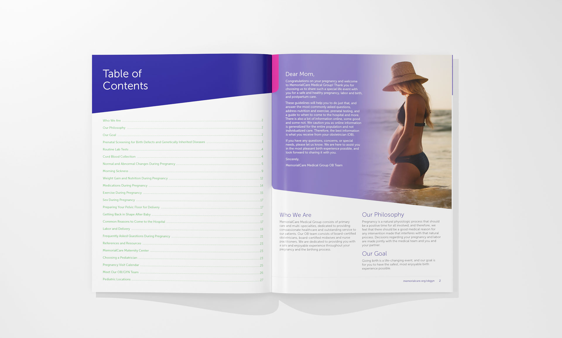
Guidebooks were designed to help patients move through unfamiliar medical experiences with greater confidence. Clear hierarchy, generous spacing, supportive photography, diagrams, and consistent navigation reduced visual friction while preserving a premium brand experience.
MemorialCare
A guide designed around reassurance.
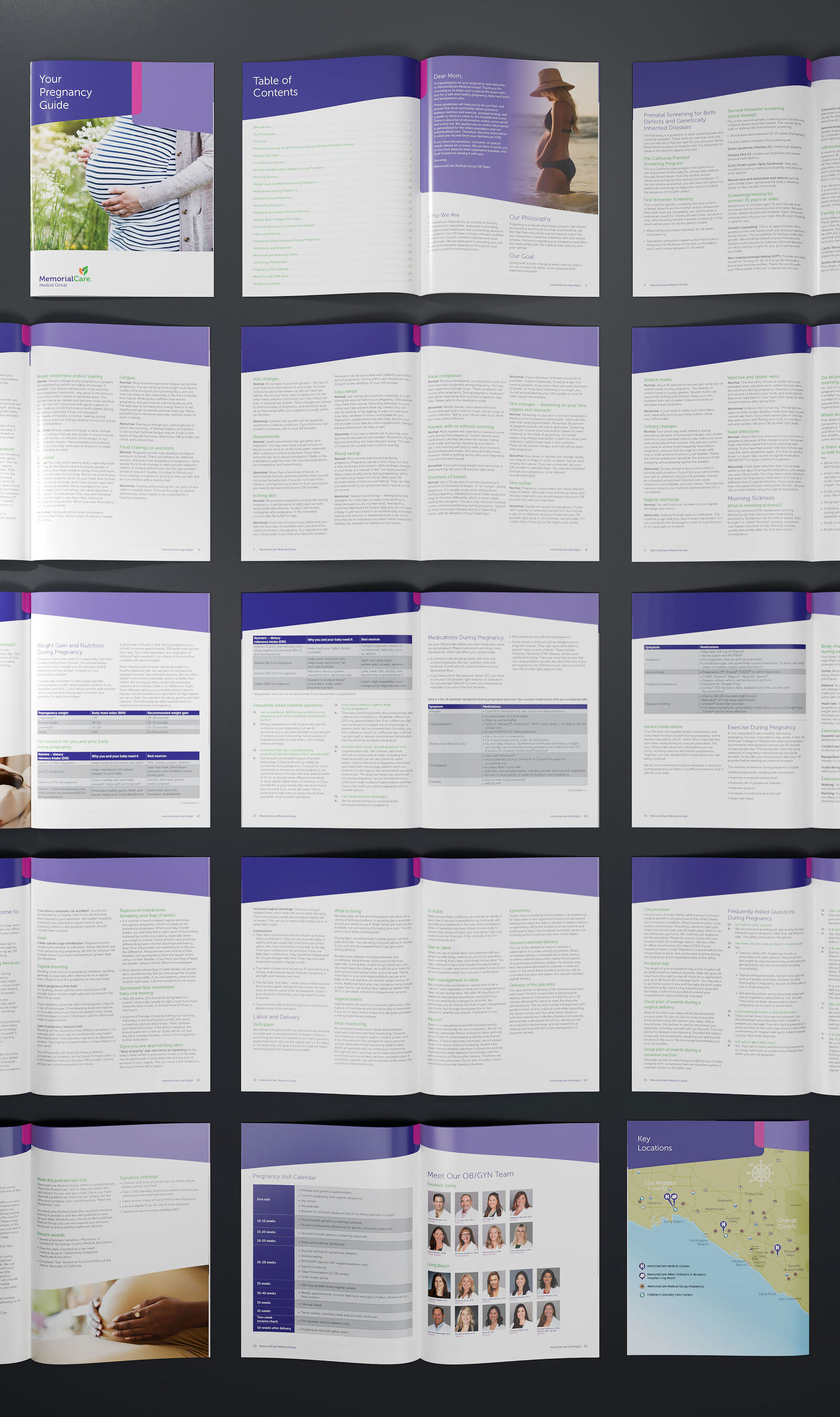
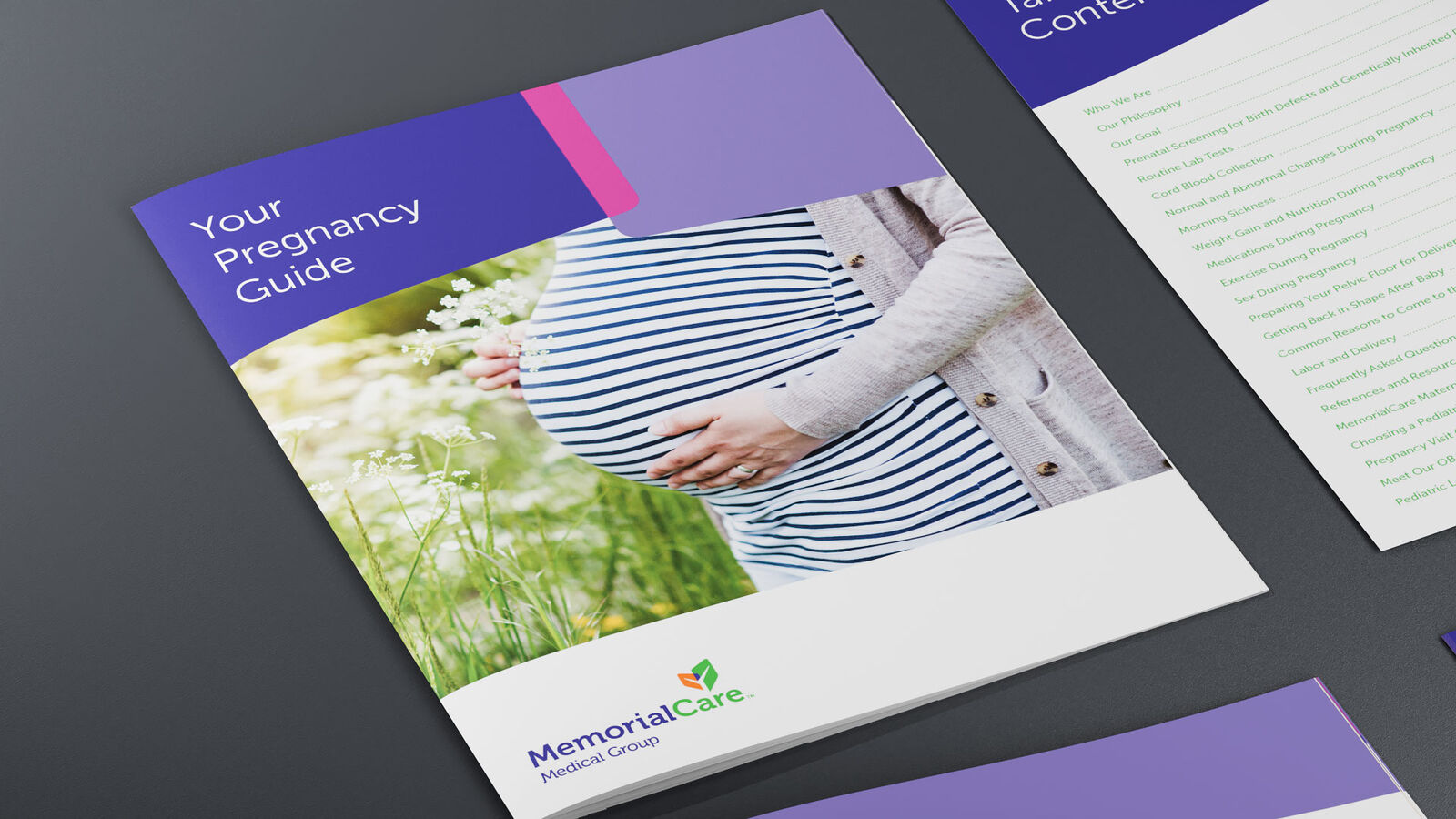
The pregnancy guide paired practical information with lifestyle photography and a softer visual rhythm, creating a patient resource that felt supportive, accessible, and consistent with the larger brand.
Modular Campaign Collateral
One system, many audiences.
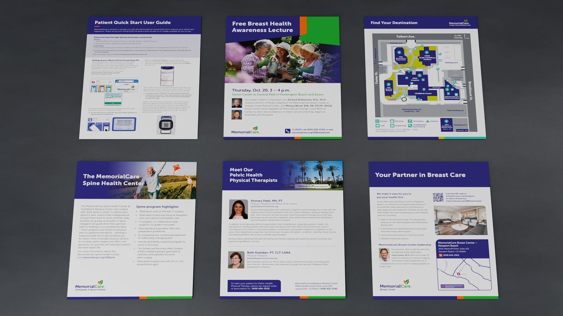
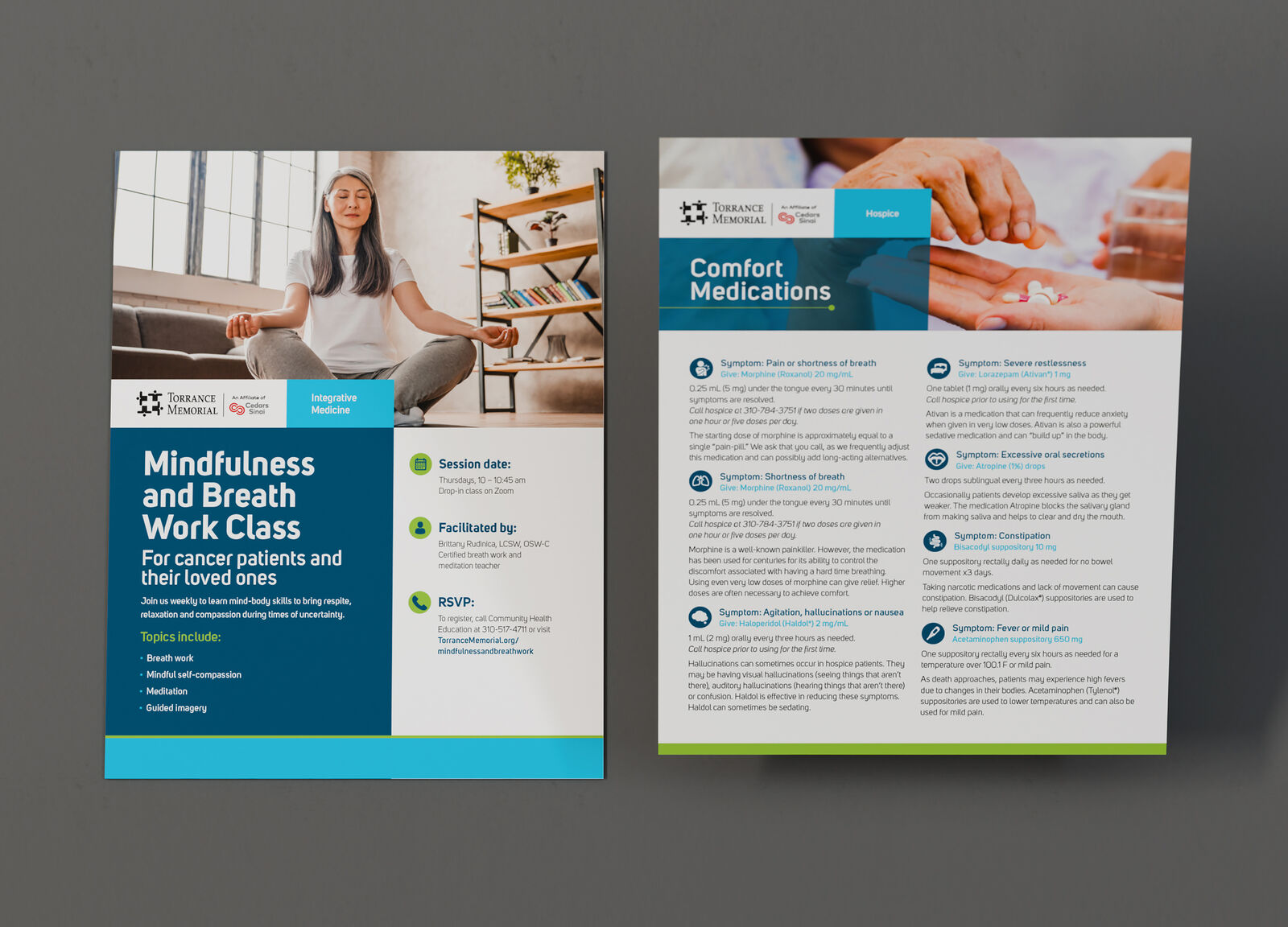
Flyers, event materials, service-line campaigns, and patient education pieces were built from a common visual foundation, then adjusted for tone, audience, and clinical context. The result was coordinated at scale without sacrificing relevance.
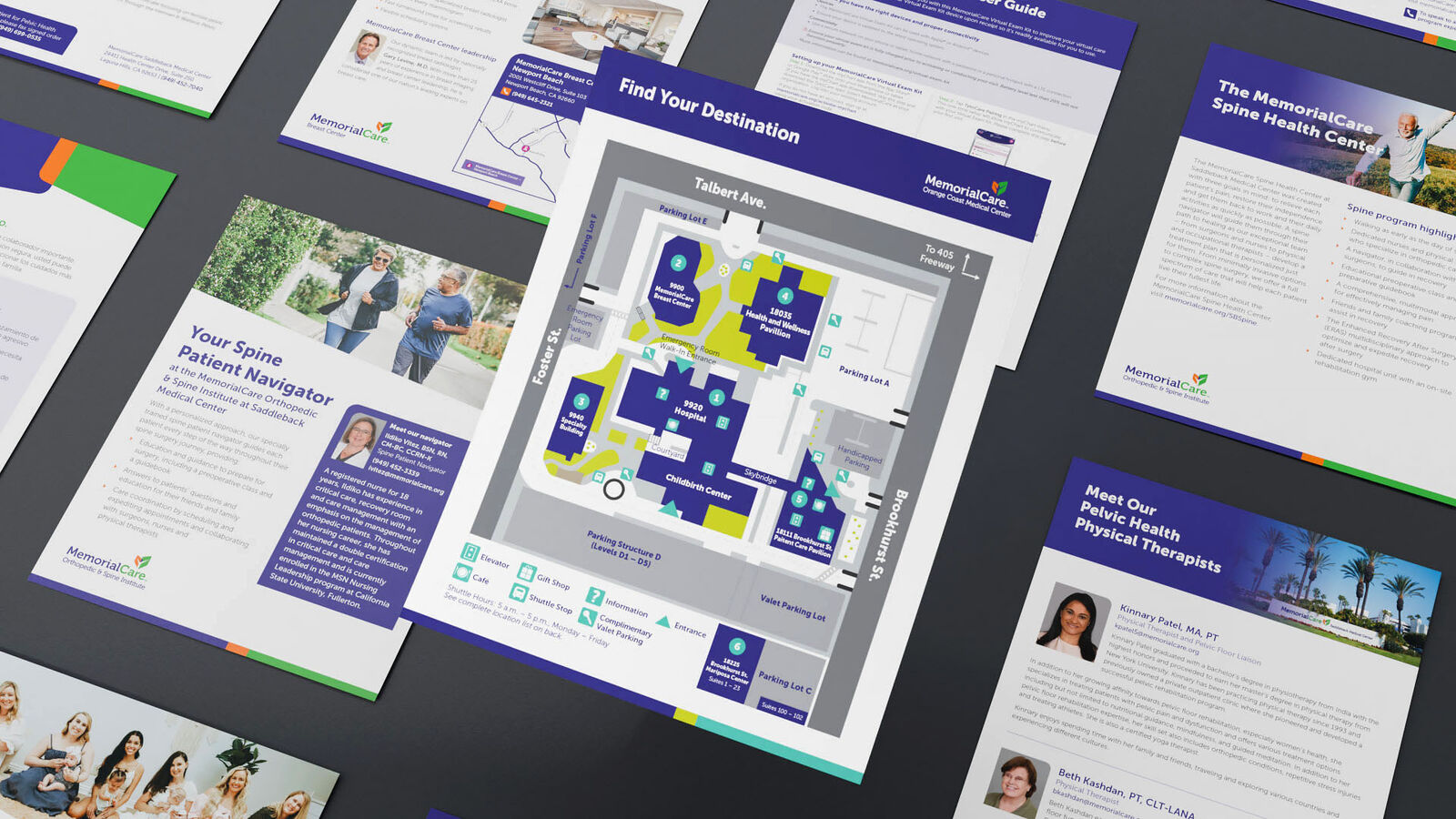
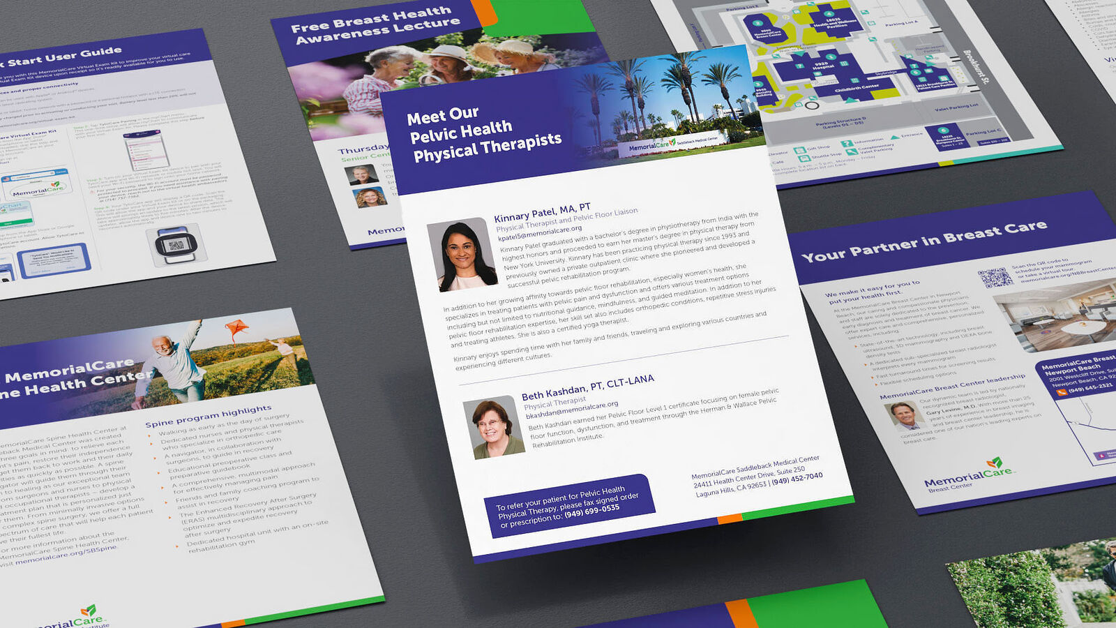
Torrance Memorial · Campaign Extensions
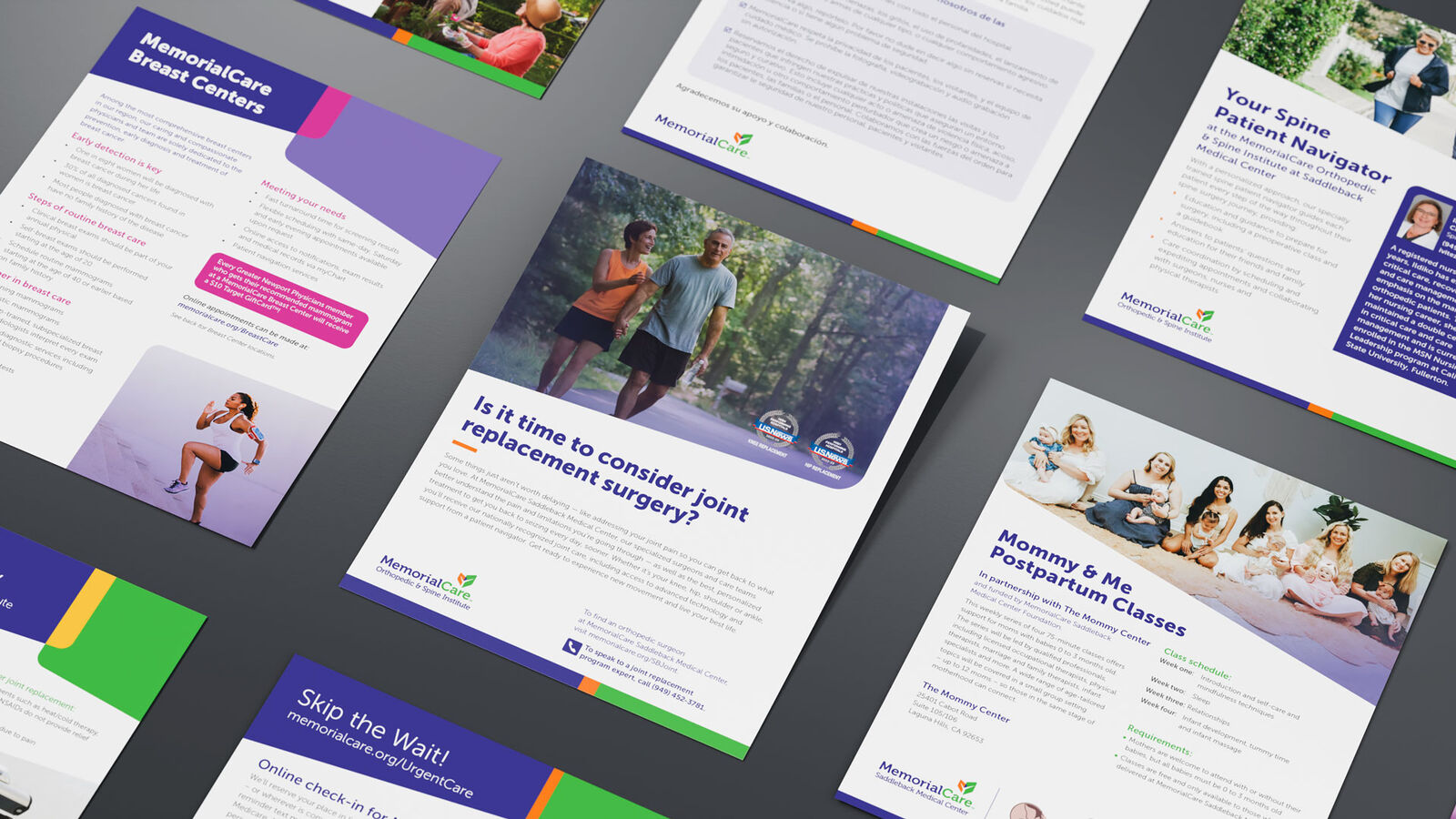
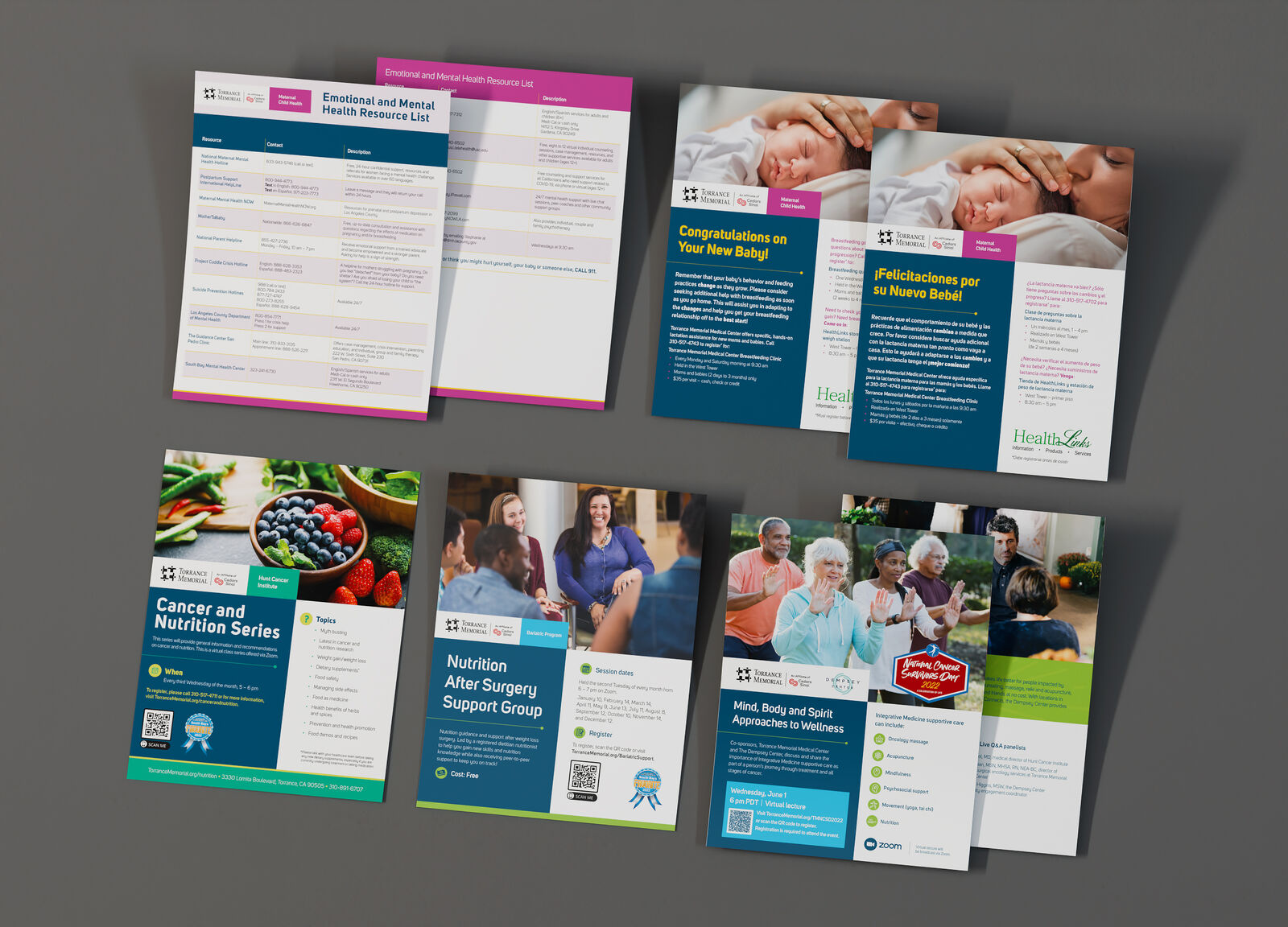
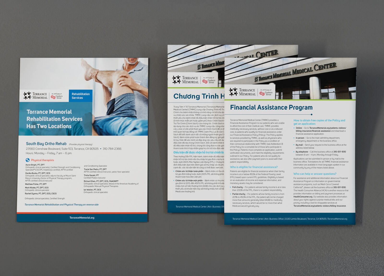
Flexible enough for wellness, rehabilitation, events, and education.
The same design discipline extended into branded flyers and program materials, allowing each topic to feel distinct while maintaining the trust, clarity, and consistency expected from a healthcare system.
Outcome
A cohesive healthcare design language built to inform, reassure, and guide.
Across patient guides, publications, illustrations, maps, motion, and campaign collateral, the work balanced brand consistency with empathy and usability — creating experiences that felt polished, accessible, and appropriate for the people relying on them.